
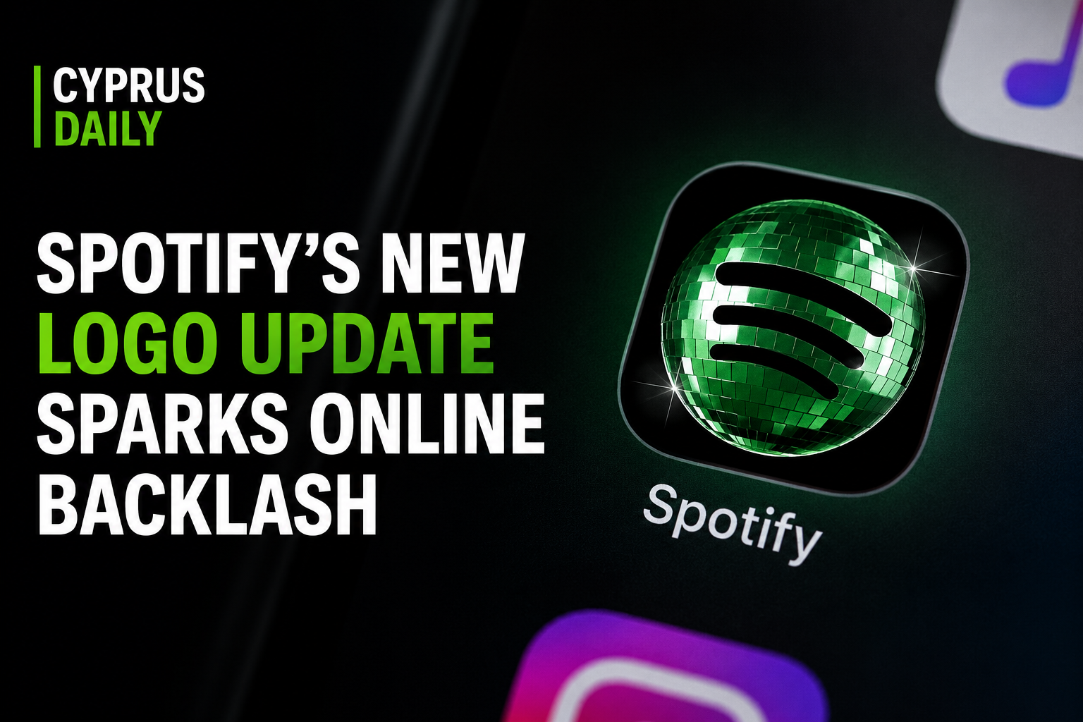
Spotify has found itself at the center of online criticism after users noticed a dramatic change in the platform’s app icon and logo color. The update introduced a much brighter neon-green shade, replacing the darker green design many users had grown familiar with over the years.
Almost immediately after the redesign appeared on phones worldwide, social media platforms such as X, Instagram, Reddit, and TikTok filled with reactions, memes, and criticism. Many users described the logo as “too bright,” “radioactive,” and “hard to look at,” especially in dark mode.
Some viral comments included:
- “Why does Spotify look radioactive now?”
- “It looks like a fake Spotify app.”
- “My eyes hurt every time I open it at night.”
- “Who approved this green?”
While some users defended the redesign and said the brighter color makes the app stand out more, many others argued that the update removed the clean and recognizable look Spotify had built over the years.
The company has not officially responded to the backlash, but the debate continues spreading online as screenshots comparing the old and new logos gain millions of views across social media platforms.
The discussion once again highlights how even small visual changes by major tech companies can trigger massive reactions from users worldwide.

